Infographics tell a story
Remember when you were a child and you loved it when your parents read you a book? You would listen to the story, but you really paid attention to the pictures. As adults we are really not much different. We appreciate the words in document, but we also value the pictures. As the 1971 Rod Stewart song is titled, Every Picture Tells a Story.
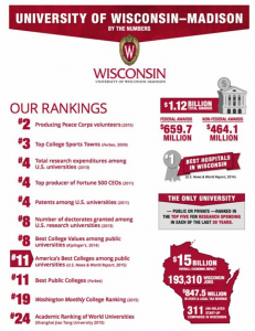
 The University of Wisconsin, my alma mater, recently sent an electronic communications to alumni to highlight recent university rankings. They used an infographic to highlight the terrific standings. Each year, U.S. News & World Report rank the nation’s universities and the University of Wisconsin typically ranks in the top tier in a variety of areas. People love a winner and promoting these rankings offers an opportunity for Wisconsin to tell us how valuable our degree is in present day, as well as an opportunity to prove the money we are investing as alumni is paying dividends. Further, universities use this as an opportunity to attract new fundraising or additional gifts from those of us who may have already given this year.
How is your non-profit organisation using infographics to tell your story? You likely already have information together to tell a donor care or stewardship story. You likely put this type of information in writing. Why not translate it to an infographic, as well? Remember adults are pretty split in terms of absorption of information. Some adults learn by reading text and others by visual representation. Play to both audiences to be sure you capture the attention of the majority.
For universities in Asia-Pacific, U.S. News & World Report announced a global edition of the rankings as coming 6 Oct! Perhaps your alma mater or perhaps your university employer will be listed in this global edition.
How about a shout out to the University of Wisconsin for their outstanding achievements and for ranking so high amongst US universities? On Wisconsin!
